What Size Are The New Instagram Grid In 2026 ?

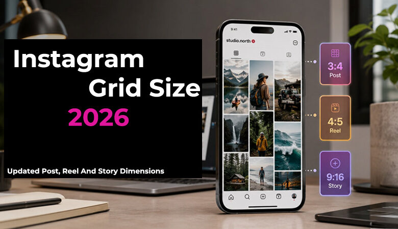
A post can look sharp in the feed and still feel oddly cropped on your profile. That is usually not a design mistake; it is a placement issue. In 2026, Instagram content moves between feed posts, Reels, Stories, covers, and grid previews more often than before. When you understand the Instagram grid size 2026, it becomes easier to protect faces, text, logos, and products before they get cut off.
Instagram Grid Size 2026: Quick Answer
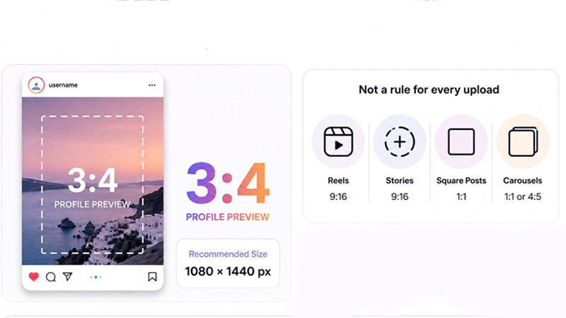
For most creators and brands, the safest way to think about Instagram grid size 2026 is a 3:4 profile preview. In practical terms, 1080 × 1440 px is a strong size to design around when you care about how a post looks on your profile. Still, this is not a rule for every upload. Reels, Stories, square posts, and carousels each behave differently, so check the grid crop before posting anything with text, faces, logos, or product details.
What Changed in the New Instagram Grid in 2026?
The biggest change is how profile previews behave. Older layouts encouraged square-first design, but the newer grid gives vertical content more room, which affects covers, product shots, and text-based posts. A design that looked balanced in a 1:1 template can now feel too tight or badly framed. For brands, this makes profile consistency more important than simply uploading a sharp image. When planning Instagram grid size 2026, think less about one fixed post size and more about how each visual is cropped across placements.
New Instagram Grid Size: 3:4 Profile Preview Explained
For practical design work, the new Instagram grid should be treated as a 3:4 profile preview, not a square thumbnail. That is why Instagram grid size 2026 matters when you prepare covers, product posts, and branded visuals. A useful working size is 1080 × 1440 px, but the real goal is better framing, not just a bigger file. Keep titles, faces, logos, and product details inside a central safe area so the profile grid stays clean even when Instagram adjusts the preview crop.
Instagram Image Sizes 2026: Grid, Posts, Reels, Stories, and Carousels
Do not build every Instagram visual from the same canvas. A product carousel, a talking-head Reel, a Story promo, and a profile cover all need different spacing. The table below gives you the working sizes most creators actually need, but leave extra breathing room around text and key visuals. This is where Instagram grid size 2026 becomes useful, because a clean feed post can still lose important context inside the profile preview.
| Content Type | Recommended Size | Ratio | Best Use |
| Profile grid preview | 1080 × 1440 px | 3:4 | Clean profile layout |
| Square post | 1080 × 1080 px | 1:1 | Simple branded posts |
| Portrait post | 1080 × 1350 px | 4:5 | More feed space |
| Reel | 1080 × 1920 px | 9:16 | Full-screen video |
| Story | 1080 × 1920 px | 9:16 | Daily updates |
| Carousel | 1080 × 1350 or 1080 × 1440 px | 4:5 or 3:4 | Educational slides |
| Reel cover | 1080 × 1920 px | 9:16 | Profile-safe cover |
Instagram Post Size 2026: Square, Portrait, Landscape, and 3:4 Photos
Square posts are still fine for quotes, icons, and simple announcements, but they should not be your automatic choice anymore. A portrait layout gives a product, face, or tutorial more room in the feed. Landscape works best only when the width adds value, such as before-and-after shots or wide scenes. For mobile photos, 3:4 usually feels cleaner, but check the edges before posting because Instagram grid size 2026 can still change the profile preview.
Instagram Reel and Story Size in 2026
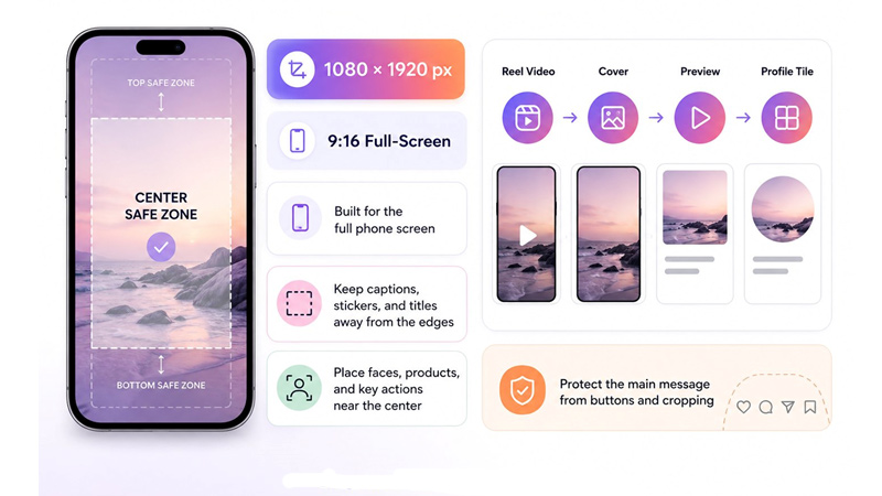
Reels and Stories should still be built at 1080 × 1920 px, since that fits the full phone screen. The part people often miss is what happens after upload. A Reel may show as a video, a cover, a preview, or a profile tile. So when you plan around the Instagram grid size 2026, keep captions, stickers, and titles away from the edges. Put faces, products, and key actions closer to the center so the main message does not get hidden by buttons or cropping.
Instagram Reel Cover Size: How to Avoid Cropping in the Grid
A Reel cover should be designed at 1080 × 1920 px, but the title should not fill the full screen. The cover may appear smaller on your profile, so use a short headline, strong contrast, and enough empty space around the subject. Place the face, product, or main text in the middle area, not near the corners. Before publishing, check the cover preview carefully, because the Instagram grid size 2026 can crop the design differently from the full Reel view.
Instagram Grid Preview Vs Feed Post Size
A feed post is what people see after they tap or scroll, while the grid preview is the small version that shapes the first impression of your profile. That difference matters for visual hierarchy. A headline that reads well in the feed may feel cramped in the grid, and a centred product may look off if the crop shifts. When reviewing Instagram grid size 2026, compare both views before posting so your profile layout still looks intentional, not accidentally cropped.
Instagram Safe Zone Tips for Text, Logos, Faces, and Product Images
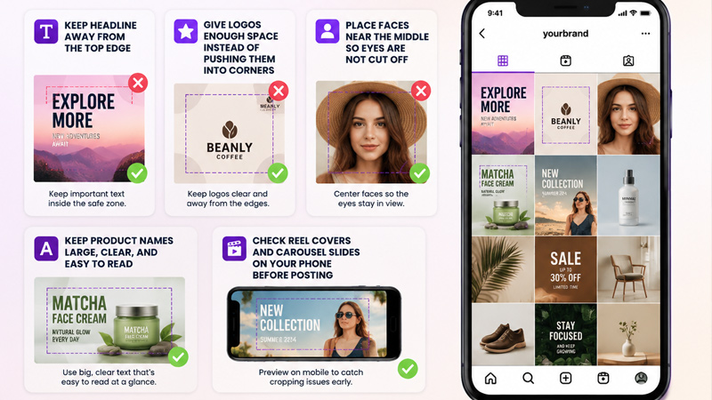
A good Instagram post should still make sense when someone sees it for half a second on your profile. With an Instagram grid size of 2026, the safe zone matters because the edges are where most cropping problems happen.
- Keep the headline short and away from the top edge.
- Give logos enough space instead of pushing them into corners.
- Place faces near the middle so eyes are not cut off.
- Keep product names large, clear, and easy to read.
- Check Reel covers and carousel slides on your phone before posting.
These small checks help protect brand clarity without making the design feel crowded.
Common Instagram Sizing Mistakes to Avoid in 2026
Most grid problems start before the post is uploaded. When you plan around the Instagram grid size 2026, watch for small design choices that make a clean post look messy later.
- Reusing an old square template for every format.
- Placing the product too close to the frame.
- Adding a long Reel cover title.
- Mixing different carousel slide sizes.
- Exporting a blurry or compressed file.
- Checking the feed view but not the profile view.
Avoiding these mistakes gives your profile page a cleaner, more intentional look.
Instagram Size Checklist Before You Post
Before posting, check the design on a real phone. Make sure the image is not blurry, the title is easy to read, and the main subject still makes sense as a small preview. For Reels, Stories, and carousel slides, leave clear space around buttons, stickers, and captions. One final check against the Instagram grid size 2026 can save you from cropped text after upload.
FAQ About Instagram Grid Size 2026
What size should I design for now?
For profile planning, treat Instagram grid size 2026 as a 3:4 preview. A practical canvas is 1080 × 1440 px.
Can I still post square images?
Yes. Square posts are still useful for quotes, icons, and simple updates, but they may look less full on the profile.
Why does my Reel cover get cut off?
The full cover and profile tile are not always shown the same way. Keep titles near the center.
Do old templates need fixing?
Only the important ones. Start with covers where faces, text, or products sit too close to the edge.